Quiet Luxury, Elevated: Neutral Palettes with Rich Textures
Today we explore neutral palettes and rich textures for sophisticated renovation schemes, discovering how restrained color can feel warm, how layered tactility adds compelling depth, and how to plan timeless decisions that outlast trends. Expect designer-tested strategies, small but transformative details, and real stories that illuminate successes and prevent missteps. Share your favorite pairings, subscribe for new insights, and tell us where you’re stuck; we’ll help you move from inspiration to confidently curated rooms that feel personal, calm, and enduring.

Undertones That Redirect Mood
Two grays can tell wildly different stories: violet-leaning hues soften sharpened spaces, while green-based grays calm warmth from oak floors or brass hardware. Beiges slip peach or pink without careful sampling, and putty hues may turn muddy next to cool marble. Test on multiple walls, observe from breakfast to dusk, and pair with your room’s fixed elements—flooring, stone, and metal. The right undertone harmonizes contrasts, making everything else seem thoughtfully chosen without shouting for attention.
Reading Light, Measuring LRV
Light Reflectance Value (LRV) predicts how bright a color feels, yet many skip this critical number. High-LRV paints bounce daylight, expanding compact rooms, while midrange values generate intimacy without gloom. Track natural light orientation—north tends to cool; south often warms—and balance accordingly. Try two adjacent sheens in shadowy hallways to keep neutrality crisp. Photograph samples at different hours, then compare on a neutral screen. Document what your eyes observe and what the meter suggests; balancing both delivers dependable results.
Textiles That Invite Touch
Start with a quiet hero: a heavyweight linen sofa or wool-blend rug establishes an approachable foundation. Layer bouclé cushions for softness, then add a tighter herringbone or basketweave to sharpen the composition. Vary pile height and drape for movement when you walk around the room. Neutral does not mean monotone; it means carefully managing temperature, sheen, and hand. Aim for textiles that encourage bare feet and unplanned naps, and notice how even a single throw can recalibrate the entire space.
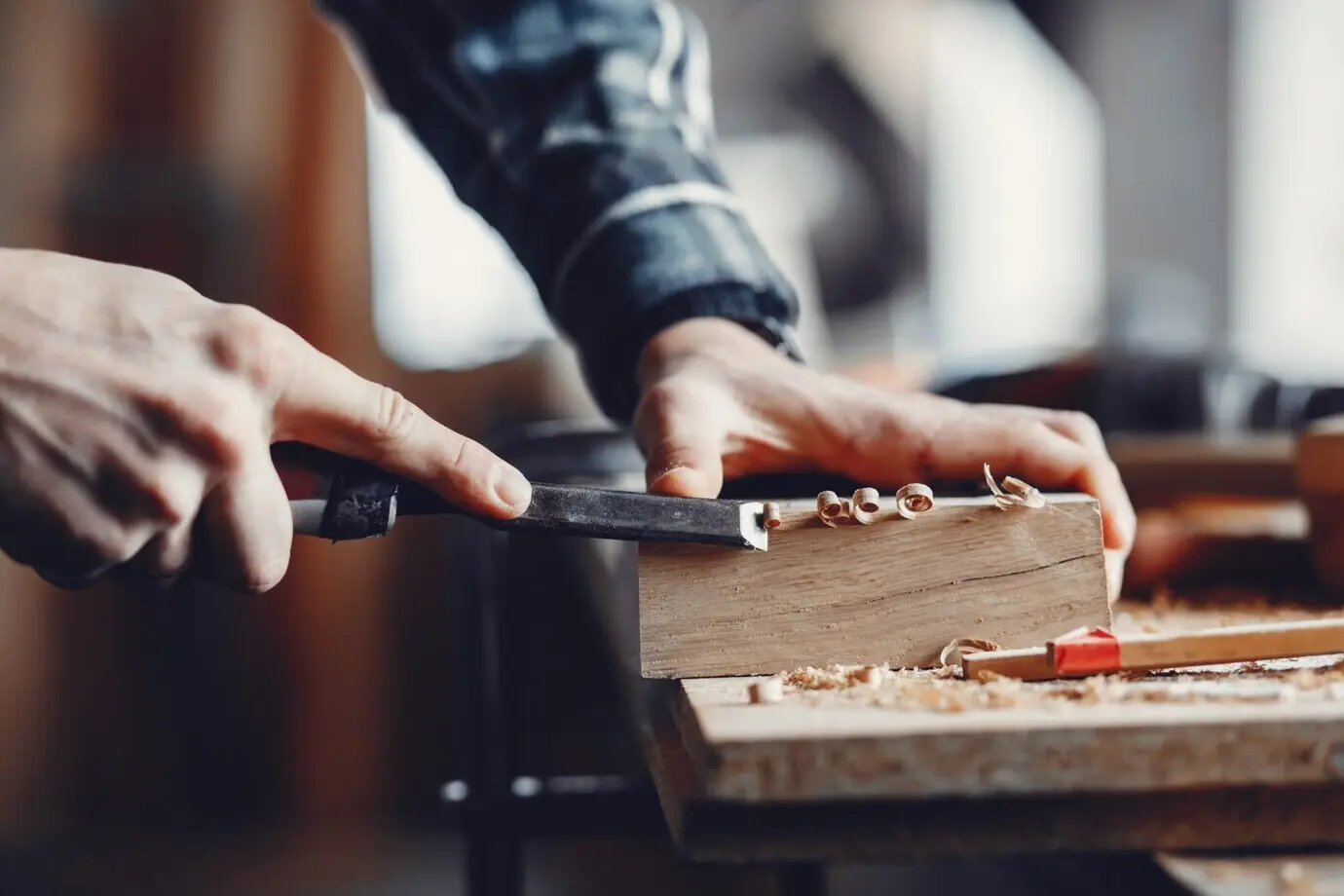
Stone, Wood, and Ceramic Counterpoints
Honed stone diffuses light, while leathered finishes offer delicious grip against smooth cabinetry. Rift-sawn oak counters busy veining with linear calm, and handmade ceramic tile brings slight irregularities that charm rather than distract. Juxtapose cold and warm surfaces to keep neutrality alive, not static. Touch choices before purchase whenever possible; photographs rarely convey temperature or tactility. In wet areas, select slip-resistant finishes, and in traffic zones, consider hardness and maintenance habits so the beauty you install remains beautiful with real-life use.

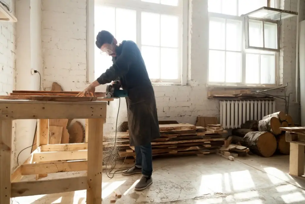
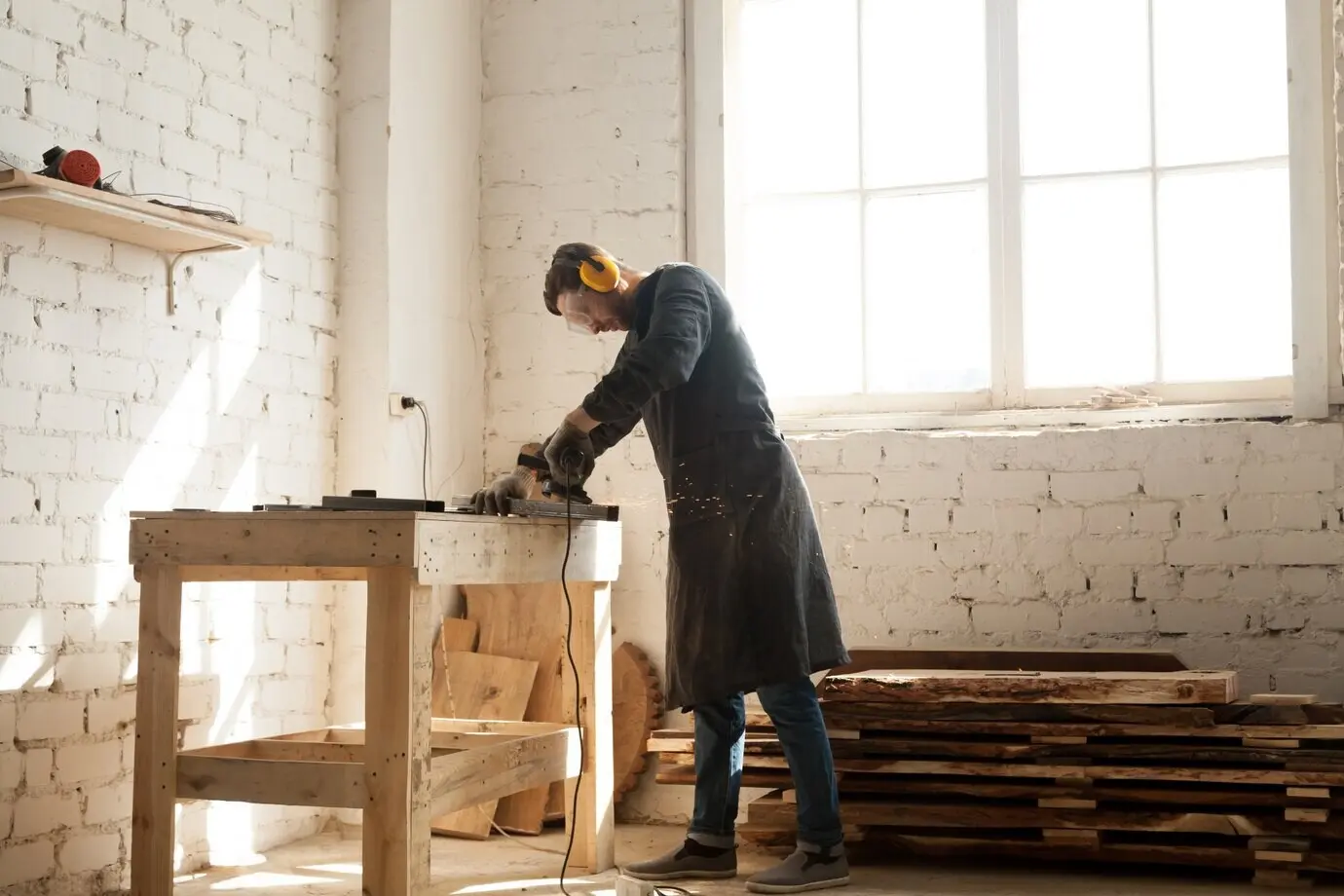
From Vision to Plan: Moodboards, Samples, and Specifications
In sophisticated renovations, beautiful ideas live or die by process. A strong plan translates inspiration into durable, coordinated decisions, reducing costly changes later. Build a physical kit of paint drawdowns, fabric swatches, finish chips, and photos of fixed elements. Add notes about suppliers, lead times, and maintenance. Sequence the installation: where do heavy trades precede delicate finishes, and how are touch-up materials stored? When all elements meet on a single board—and timeline—you’ll catch clashes early and defend the serenity you imagined.
Light and Finish: Sheen, Shadow, and Glow
Light sculpts neutrals into moments—matte absorbs, satin balances, semi-gloss bounces. Shadow is a design tool, not a flaw, revealing texture’s contour and depth. We’ll map sheens to surfaces, refine metallic reflectivity, and choreograph window treatments that filter rather than smother. Dimmer controls and layered fixtures stabilize mood from morning coffee to midnight reading. In spaces with minimal color contrast, these micro-decisions become your drama, gently pulling attention to craftsmanship. When light becomes your collaborator, the palette feels alive without visual noise.

Real-World Stories: Spaces That Whisper Luxury
Ideas mature when we see them lived. These stories trace decisions from first sketch to quiet triumph, detailing what worked, what surprised, and how restraint produced richness. Notice how each space uses few colors but many textures, balancing practicality with elegance. You’ll see where budgets flexed, where patience paid off, and how small sensory choices shaped emotional comfort. Borrow moves, avoid pitfalls, and share your own examples in the comments so others can learn from your journey and celebrate progress together.
Longevity, Care, and Sustainable Choices
A sophisticated renovation considers tomorrow’s beauty as carefully as today’s reveal. Choose materials that endure, finishes that age gracefully, and certifications that reduce indoor pollutants. Maintenance plans protect investments; mindful sourcing protects the planet that inspires our palette. We’ll translate durability metrics, outline cleaning routines that preserve texture, and highlight eco-forward options that honor craft and health. Share your maintenance wins or questions, and subscribe for future checklists—because a home designed to last needs a care ritual as intentional as the design itself.
Durability Metrics That Matter
Martindale rub counts reveal abrasion resistance for upholstery; look for higher numbers in family rooms. Mohs hardness guides stone selection where knives, sand, and heels collide. UV stability matters for fabrics near windows, and water absorption affects tile in baths. Evaluate VOC levels and finishes that resist yellowing. When numbers and touch tests align, neutrals keep their integrity under real use. Document sources and care instructions now; your future self will thank you during holiday rushes and unexpected gatherings.
Cleaning and Maintenance Rituals
Texture rewards care. Vacuum rugs with the right head, brush bouclé gently, and blot spills fast rather than rubbing. Use pH-appropriate stone cleaners and reseal counters on schedule. Dust layered surfaces often to preserve shadow play. Rotate cushions and rugs for even wear, and keep a labeled kit of touch-up paints and finish samples. A short monthly ritual preserves the serenity you worked so hard to craft, allowing patina to bloom without decay and keeping every surface pleasant to touch.
Responsible Materials and Certifications
Seek FSC-certified wood, Greenguard Gold finishes, and natural fibers from transparent supply chains. Recycled-content stone composites can lower extraction impact while delivering tactile depth. Choose upholsteries free from harmful flame retardants when codes allow, and favor local makers to trim transport emissions. Longevity is sustainability’s quiet cousin: buy fewer, better pieces, and repair rather than replace. When the materials you live with respect your air and values, neutrals feel not just beautiful—but ethical, grounding, and genuinely restorative.